May 18, 2026
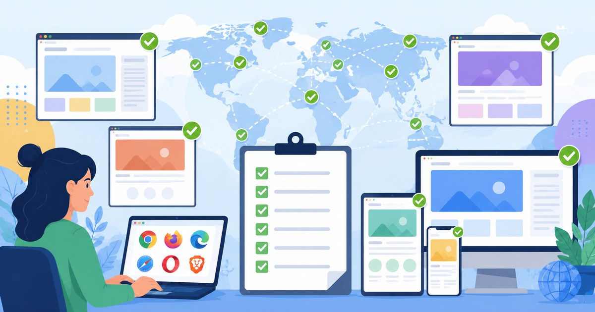
Cross-Browser Coverage Checklist Generator
Build a practical cross-browser testing checklist and browser testing matrix for your product, users, devices, risk areas, and release process.
A good cross-browser testing strategy is not “test everything everywhere.” It is a defensible coverage plan that matches your users, product risk, technical constraints, and release cadence. This cross-browser coverage checklist generator helps QA managers, frontend teams, product teams, and SDETs decide which browsers, operating systems, devices, screen sizes, and test types belong in their browser testing matrix.
How to use this cross-browser coverage checklist generator
Use the generator below as a structured decision tool. Start by answering the questions, then translate the recommendations into a browser coverage checklist your team can maintain over time.
This is intentionally practical rather than exhaustive. The goal is not to produce a giant matrix that nobody runs. The goal is to create a browser testing matrix that catches the issues most likely to affect your users and your business.
A useful browser matrix is not the biggest one. It is the smallest one that still protects your users and your critical flows.
Step 1, define your product context
Select the closest description of your product:
- Consumer web app, broad public audience, unknown device mix, likely mobile-heavy.
- B2B SaaS, authenticated users, often desktop-heavy, may have enterprise browser constraints.
- Ecommerce or checkout flow, revenue-sensitive, high device diversity, payment and address edge cases matter.
- Internal tool, controlled environment, fewer browser combinations, but high productivity impact if broken.
- Marketing site or content site, broad anonymous traffic, SEO, accessibility, layout, forms, and analytics matter.
- Developer tool or technical dashboard, desktop-heavy, keyboard-heavy, complex UI states, often Chromium-heavy but not always.
Your context changes the default checklist. A public ecommerce checkout deserves more mobile Safari attention than an internal admin console used only on managed Windows laptops. A design-heavy marketing site may need more visual layout checks across viewport widths than a data-entry back office tool.
Step 2, choose your supported browser tiers
Most teams should avoid treating every browser equally. A tiered model is easier to explain and maintain.
| Tier | Meaning | Typical expectation |
|---|---|---|
| Tier 1 | Fully supported | Automated smoke and regression coverage, manual exploratory testing for risky releases, release-blocking defects |
| Tier 2 | Supported with limits | Smoke coverage and targeted manual checks, important defects fixed, visual differences accepted if non-blocking |
| Tier 3 | Best effort | Basic access should work, no dedicated regression suite, fixes prioritized by customer impact |
| Unsupported | Explicitly out of scope | Show a clear message or document requirements if needed |
A browser coverage checklist becomes much easier to defend when it says “Chrome on current Windows is Tier 1” and “Firefox ESR is Tier 2 for enterprise customers” instead of vaguely saying “we support modern browsers.”
Step 3, fill out the checklist inputs
Use these inputs to generate your first browser testing matrix.
Audience and traffic inputs
- What percentage of traffic is mobile, tablet, and desktop?
- Which browsers appear in analytics for the last 30, 90, and 180 days?
- Are there known enterprise customers using managed browsers or older OS versions?
- Are users concentrated in specific regions where Android device fragmentation is higher?
- Do you have authenticated-product analytics, not just public-site analytics?
A common mistake is using only marketing-site analytics to decide product-app coverage. Your pricing page may be 70 percent mobile Safari, while the logged-in workspace may be 85 percent desktop Chrome. If your checkout is a separate flow, analyze that separately too.
Product risk inputs
- Does the app include payment, checkout, billing, signup, or login flows?
- Does it depend on camera, microphone, geolocation, file upload, drag and drop, clipboard, WebGL, WebRTC, push notifications, or offline storage?
- Does it include complex layouts, sticky headers, virtualized tables, modals, responsive navigation, or canvas elements?
- Does it rely on third-party scripts, embedded widgets, identity providers, payment providers, maps, or chat tools?
- Are accessibility requirements contractual, regulatory, or brand-critical?
Risk matters because cross-browser bugs often hide in browser APIs and UI behavior, not only in CSS. A static documentation site and a browser-based video editor need completely different QA browser checklists.
Release inputs
- How often do you deploy to production?
- Do you have a staging environment that closely matches production?
- Can tests run in parallel in CI, or are they mostly manual?
- Which failures should block release?
- Who owns triage when a browser-specific failure appears?
A checklist that looks reasonable for monthly releases may be too slow for daily deployments. If your team ships continuously, you need a smaller blocking suite plus scheduled broader coverage.
Recommended cross-browser testing checklist
Use this checklist as a starting point, then adjust it based on your analytics and product risk.
Core desktop browser coverage
For most web products, start with:
- Chrome, latest stable, Windows
- Chrome, latest stable, macOS
- Safari, latest stable, macOS
- Edge, latest stable, Windows
- Firefox, latest stable, Windows or macOS
For B2B and enterprise products, consider adding:
- Edge on managed Windows environments
- Firefox ESR if requested by customers or IT policy
- Older supported OS versions if customers cannot upgrade quickly
For developer tools or complex dashboards, include at least one non-Chromium browser in meaningful coverage. Chrome and Edge share the Chromium engine, so testing both can catch browser-integration and enterprise-policy differences, but it does not replace Safari or Firefox coverage.
Core mobile browser coverage
For public-facing products and consumer flows, mobile coverage is usually not optional.
Start with:
- Safari on current iOS
- Safari on previous major iOS version if your analytics justify it
- Chrome on Android, current stable
- Samsung Internet if it appears materially in your analytics
Remember that browser names on mobile can be misleading. On iOS, third-party browsers use Apple’s WebKit engine, although their UI and integration details may differ. That means Chrome on iOS is not equivalent to Chrome on Android or Chrome on desktop.
Operating system coverage
The OS matters because fonts, scrollbars, input behavior, permissions, dialogs, file pickers, and rendering details can differ.
A practical OS checklist:
- Windows 11 for mainstream desktop users
- Windows 10 if your user base or enterprise customers still require it
- Current macOS for Safari and Chrome coverage
- Current iOS and one previous major iOS version for mobile Safari-heavy products
- Current Android and one older commonly used Android version for public consumer products
Avoid adding OS versions just because they exist. Add them because they represent users, revenue, contractual obligations, or meaningful technical risk.
Screen resolution and viewport checklist
Screen coverage should be based on layout breakpoints and real usage, not a random list of device names.
A good baseline:
- Small mobile, around 360px wide
- Large mobile, around 390px to 430px wide
- Tablet portrait, around 768px wide
- Tablet landscape or small laptop, around 1024px wide
- Standard desktop, around 1366px to 1440px wide
- Large desktop, around 1920px wide
Then map these to your CSS breakpoints. If your design system has breakpoints at 480, 768, 1024, 1280, and 1536, test just below, at, and just above the riskiest breakpoints for layout-heavy releases.
Example viewport set for Playwright-style automation:
const viewports = [
  { name: 'mobile-small', width: 360, height: 740 },
  { name: 'mobile-large', width: 430, height: 932 },
  { name: 'tablet', width: 768, height: 1024 },
  { name: 'small-desktop', width: 1366, height: 768 },
  { name: 'large-desktop', width: 1920, height: 1080 }
];
Do not confuse responsive viewport testing with real device testing. Viewport simulation is useful, fast, and cheap, but it does not fully reproduce mobile browser UI, touch behavior, device pixel ratio, performance constraints, virtual keyboards, or OS-level permission flows.
Build your browser testing matrix
A browser testing matrix should be small enough to run and clear enough to discuss during release planning. Here is a practical template.
| Coverage item | Tier | Test type | Frequency | Owner | Release blocking? |
|---|---|---|---|---|---|
| Chrome latest, Windows 11, desktop | 1 | Automated smoke and regression | Every PR or merge | QA/SDET | Yes |
| Safari latest, macOS, desktop | 1 | Automated smoke, targeted manual | Daily and pre-release | QA/frontend | Yes for critical flows |
| Safari, current iOS, real device | 1 | Smoke, checkout/signup, layout | Daily or pre-release | QA | Yes for mobile-critical flows |
| Chrome latest, Android, real device | 1 | Smoke, forms, navigation | Daily or pre-release | QA | Yes for mobile-critical flows |
| Firefox latest, desktop | 2 | Smoke and risky features | Nightly | QA/SDET | Usually no, unless severe |
| Edge latest, Windows | 2 | Smoke and enterprise flows | Nightly or pre-release | QA | Context-dependent |
| Tablet viewport | 2 | Layout and navigation | Pre-release | QA/frontend | Usually no |
This matrix is not universal. It is a starting point. A mobile-first marketplace may promote Android and iOS devices to the top. An enterprise HR platform may care more about Edge on Windows and SSO behavior.
Interactive generator logic you can implement on your site
If you want to turn this article into a real interactive tool on testingtoolguide.com, you can implement the generator as a simple scoring model. The scoring does not need to be mathematically perfect. It needs to make the team’s assumptions visible.
Here is a compact example of the logic behind a cross-browser coverage checklist generator:
const baselineTargets = [
  { id: 'chrome-win', label: 'Chrome latest on Windows', tier: 1, score: 80 },
  { id: 'chrome-mac', label: 'Chrome latest on macOS', tier: 1, score: 65 },
  { id: 'safari-mac', label: 'Safari latest on macOS', tier: 1, score: 70 },
  { id: 'edge-win', label: 'Edge latest on Windows', tier: 2, score: 55 },
  { id: 'firefox-desktop', label: 'Firefox latest on desktop', tier: 2, score: 50 },
  { id: 'safari-ios', label: 'Safari on current iOS', tier: 1, score: 75 },
  { id: 'chrome-android', label: 'Chrome on Android', tier: 1, score: 70 },
  { id: 'samsung-internet', label: 'Samsung Internet on Android', tier: 3, score: 30 }
];
function generateCoverage({ productType, mobileShare, enterpriseUsers, checkoutRisk }) { return baselineTargets .map(target => { let score = target.score;
  if (mobileShare > 50 && target.id.includes('ios')) score += 20;
  if (mobileShare > 50 && target.id.includes('android')) score += 20;
  if (enterpriseUsers && target.id === 'edge-win') score += 25;
  if (enterpriseUsers && target.id === 'firefox-desktop') score += 10;
  if (checkoutRisk && ['safari-ios', 'chrome-android', 'safari-mac'].includes(target.id)) score += 15;
  if (productType === 'internal-tool' && target.id.includes('mobile')) score -= 20;

  return { ...target, score };
})
.sort((a, b) => b.score - a.score)
.map(target => ({
  ...target,
  recommendedTier: target.score >= 75 ? 1 : target.score >= 50 ? 2 : 3
})); }
The important part is not the exact scoring constants. It is the habit of converting product facts into coverage decisions. That is what prevents browser testing from becoming either guesswork or an unmaintainable wish list.
Suggested generator questions
A useful generator can ask 8 to 12 questions:
- What type of product are you testing?
- What percentage of usage is mobile?
- Is the product used by enterprise customers with managed devices?
- Are checkout, billing, signup, or login flows business-critical?
- Do you support customers in regions with high Android device diversity?
- Does the product use advanced browser APIs?
- Are there accessibility or compliance requirements?
- How often do you release?
- Do you have automated browser tests today?
- Do you have access to real devices or a cloud testing platform?
- Which browsers appear above a chosen analytics threshold?
- Are any browsers contractually required?
The output should include:
- Recommended Tier 1, Tier 2, and Tier 3 browsers
- Suggested desktop and mobile OS combinations
- Viewport checklist
- Manual testing checklist
- Automation candidates
- Release-blocking guidance
- Notes on what to remove from scope
That last item matters. A helpful generator should not only add coverage, it should also help teams avoid waste.
What to include in a QA browser checklist
A QA browser checklist should cover more than “open page in browser.” Cross-browser bugs often appear in specific behaviors.
Layout and rendering checks
Include checks for:
- Header, footer, side navigation, and sticky elements
- Responsive menus and hamburger navigation
- Modals, drawers, popovers, and tooltips
- Tables, grids, and virtualized lists
- Text wrapping, truncation, and overflow
- Custom fonts and fallback fonts
- Icon rendering and SVG behavior
- Print styles if users print invoices, labels, reports, or receipts
Safari-specific layout differences are common enough that Safari should receive meaningful attention when your app has complex CSS. Firefox can also expose assumptions around form controls, flexbox, grid behavior, and font rendering.
Input and form checks
Forms are a rich source of browser-specific defects. Include:
- Date, time, number, currency, and phone inputs
- Autofill and autocomplete behavior
- Password managers and one-time code fields
- File uploads and drag and drop
- Copy and paste behavior
- Validation messages and focus states
- Virtual keyboard behavior on mobile
- Submit behavior when pressing Enter
If your team uses custom-styled form controls, test them across browsers before every major design-system change. Native controls differ by browser and OS, while custom controls often introduce accessibility and keyboard issues.
Authentication and session checks
Authentication is especially sensitive to browser privacy features and cookie behavior.
Add checks for:
- Login and logout
- Session expiration
- Multi-factor authentication
- SSO redirects
- Third-party identity providers
- SameSite cookie behavior
- Cross-subdomain flows
- Incognito or private browsing behavior if relevant
For products using embedded apps, iframes, or third-party login flows, browser privacy changes can break behavior unexpectedly. Treat authentication as a Tier 1 cross-browser flow.
Payment and checkout checks
For ecommerce, SaaS billing, marketplaces, donations, bookings, or any payment flow, include:
- Cart updates
- Promo codes and discounts
- Address forms
- Tax or shipping calculation display
- Payment provider iframe behavior
- Wallet buttons where relevant
- 3D Secure or bank challenge flows in supported test environments
- Order confirmation and receipt rendering
Do not rely only on desktop Chrome for payment validation. Mobile Safari and Android Chrome can reveal keyboard, iframe, redirect, and viewport issues that desktop testing misses.
Accessibility checks
Cross-browser testing and accessibility testing overlap. Keyboard focus, semantic controls, ARIA behavior, contrast rendering, zoom behavior, and screen reader interactions can vary by browser and OS.
At minimum, include:
- Keyboard-only navigation
- Visible focus indicators
- Proper modal focus trapping
- Form labels and error associations
- Zoom to 200 percent
- Reduced motion behavior where applicable
- Screen reader smoke checks for critical flows
For standards context, see the W3C Web Content Accessibility Guidelines overview. Automated rule engines such as axe-core can help detect many common issues, but they should complement, not replace, human accessibility review.
If your team wants accessibility checks inside automated web tests, Endtest Accessibility Testing is available in Endtest, an agentic AI, low-code/no-code test automation platform. Endtest creates editable platform-native test steps and can help teams add accessibility validation without maintaining custom browser-grid infrastructure. You can also review the Endtest Accessibility Testing documentation for implementation details.
Manual, automated, and cloud-based coverage
A browser coverage checklist is only useful if the team can execute it. Most teams need a mix of approaches.
Manual testing
Manual testing is best for:
- Exploratory checks after large UI changes
- New flows where automation is not stable yet
- Visual layout review
- Mobile keyboard and gesture behavior
- Third-party flows that are difficult to automate
- Investigating a browser-specific failure
The downside is repeatability. Manual testing is expensive when repeated across many browser and OS combinations. That is why manual coverage should be targeted at risk, not sprayed across every possible environment.
Automated testing
Automated browser tests are best for:
- Login, signup, checkout, and other critical flows
- Regression coverage for stable workflows
- Cross-browser smoke checks
- CI feedback on pull requests
- Reproducing known browser-specific bugs
If your team writes its own tests, modern frameworks can run the same scenario across multiple browser projects. For example, a compact Playwright configuration might look like this:
import { defineConfig, devices } from '@playwright/test';
export default defineConfig({ testDir: ‘./tests’, projects: [ { name: ‘chromium-desktop’, use: { browserName: ‘chromium’, viewport: { width: 1366, height: 768 } } }, { name: ‘firefox-desktop’, use: { browserName: ‘firefox’, viewport: { width: 1366, height: 768 } } }, { name: ‘webkit-desktop’, use: { browserName: ‘webkit’, viewport: { width: 1366, height: 768 } } }, { name: ‘mobile-safari-like’, use: { …devices[‘iPhone 14’] } }, { name: ‘mobile-chrome-like’, use: { …devices[‘Pixel 7’] } } ] });
This kind of setup is useful, but remember the limitation: browser engines and device emulation are not always the same as running on real browsers and real devices. For many teams, the best pattern is fast simulated coverage on every change, then real-environment coverage for release candidates, nightly runs, or high-risk flows.
Cloud testing platforms and hosted grids
Building and maintaining your own browser grid can become a project of its own. You need browser versions, drivers, OS images, device access, parallelization, logs, screenshots, video, retries, and cleanup. That can be worth it for some mature engineering organizations, but many teams are better served by a hosted platform.
Endtest Cross Browser Testing is one practical option for teams that want an agentic AI, low-code/no-code test automation platform with cross-browser execution across real environments, without building their own grid. Endtest creates editable platform-native steps rather than generating Playwright, Selenium, JavaScript, Python, or TypeScript source files. Its No Code Testing, Self Healing Tests, Visual AI, and Geolocation Testing capabilities may also be relevant when evaluating browser coverage for QA-led teams.
Hosted platforms are most valuable when they reduce maintenance work without hiding the evidence you need to debug failures.
When comparing platforms, ask:
- Which browsers, OS versions, and devices are actually available?
- Are tests running on real browsers, simulated devices, emulators, or a mix?
- How is parallel execution priced?
- Can you capture video, screenshots, console logs, and network logs?
- How easy is it to reproduce a failed run locally or in the platform?
- Does it integrate with your CI system and issue tracker?
- Can non-developers contribute to test creation and triage?
The right answer depends on team shape. A frontend-heavy team may prefer code-first Playwright or Cypress. A QA-led team supporting multiple products may prefer a platform that reduces setup and maintenance. A regulated enterprise may need more control over environments and data handling.
How often should each browser be tested?
Not every browser combination needs to run on every commit. Frequency should match risk and cost.
A practical schedule:
| Frequency | What to run |
|---|---|
| Every pull request | Small smoke suite on primary desktop browser, plus unit and component tests |
| Every merge to main | Smoke suite across Tier 1 desktop browsers |
| Nightly | Broader Tier 1 and Tier 2 browser matrix, selected mobile coverage |
| Pre-release | Full checklist, real devices for critical flows, targeted exploratory testing |
| After browser or OS updates | Known-risk flows, layout checks, authentication, payments |
For continuous delivery, the blocking suite must stay small. If every pull request waits for 200 cross-browser tests across 20 environments, teams will start ignoring or bypassing results. Put the fastest, highest-signal checks early, then run broader coverage asynchronously.
For background on CI concepts, the Wikipedia overview of continuous integration is a useful starting point, but your implementation should be grounded in your team’s release risk.
Common mistakes when building a browser coverage checklist
Mistake 1, testing browsers but not flows
A matrix that says “Chrome, Safari, Firefox, Edge” is incomplete. You also need to specify which flows are tested. Opening the home page in Safari does not mean Safari checkout works.
Better:
- Chrome, full regression
- Safari, login, checkout, account settings, responsive navigation
- Firefox, smoke, file upload, dashboard filtering
- Edge, SSO, admin workflow, export reports
Mistake 2, using global browser market share blindly
Global browser share can be useful when you have no data, but it is a weak substitute for your own analytics. Your product may serve enterprise finance users, field workers on Android devices, schools on managed Chromebooks, or designers on macOS. Coverage should follow your users.
Use public market share only as a fallback. Replace assumptions with product analytics as soon as possible.
Mistake 3, ignoring Safari until late
Many teams develop primarily in Chrome, run automated tests in Chromium, and discover Safari issues right before release. Safari can expose issues in CSS, date parsing, media behavior, file upload, scrolling, viewport height, and privacy features.
If Safari is Tier 1 for your users, test it early. Waiting until release week makes every Safari issue more expensive.
Mistake 4, over-testing low-risk combinations
A huge browser testing matrix looks responsible, but it can slow releases and create triage fatigue. If a browser represents tiny usage and no contractual requirement, it may belong in Tier 3, not in the release-blocking suite.
Coverage is a product decision, not just a QA decision. Make tradeoffs explicit.
Mistake 5, forgetting observability
When a cross-browser test fails, you need enough evidence to debug it. Capture:
- Browser and version
- OS and version
- Viewport and device profile
- Screenshot at failure
- Video for complex flows
- Console errors
- Network failures
- Test data used
- Feature flags enabled
Without this context, browser failures become hard to reproduce and easy to dismiss.
A ready-to-copy browser coverage checklist
Use this as a starting checklist for your team.
Planning
- Review analytics for desktop, mobile, tablet, browser, OS, and region.
- Separate public-site analytics from authenticated-app analytics.
- Identify contractual browser or OS requirements.
- Identify critical flows, including login, signup, checkout, billing, and core workflows.
- Identify advanced browser APIs used by the product.
- Assign Tier 1, Tier 2, Tier 3, and unsupported categories.
Browser and OS coverage
- Include primary desktop Chrome environment.
- Include Safari on macOS if macOS users matter.
- Include Safari on iOS for mobile public products.
- Include Chrome on Android for mobile public products.
- Include Edge on Windows for enterprise or Microsoft-heavy audiences.
- Include Firefox where analytics, customer expectations, or technical risk justify it.
- Include older OS versions only when supported by data, contracts, or customer constraints.
Viewport and device coverage
- Test small mobile width.
- Test large mobile width.
- Test tablet portrait or equivalent breakpoint.
- Test small desktop or laptop width.
- Test large desktop width.
- Test real devices for mobile-critical flows.
- Test just below and above risky CSS breakpoints after layout changes.
Functional coverage
- Login and logout work across Tier 1 browsers.
- Signup and onboarding work across Tier 1 browsers.
- Core workflow works across Tier 1 browsers.
- Payments or billing flows work on desktop and mobile where relevant.
- Forms validate correctly and show usable errors.
- File upload, download, export, and print behavior work where relevant.
- Third-party embeds and identity providers work in supported browsers.
Accessibility and usability
- Keyboard navigation works for critical flows.
- Focus states are visible.
- Modals trap and restore focus correctly.
- Form labels and errors are accessible.
- Layout works at 200 percent zoom for critical pages.
- Touch targets are usable on mobile.
- Reduced motion preference is respected where applicable.
Release process
- Define which browser failures block release.
- Run fast smoke coverage before merge or deployment.
- Run broader cross-browser coverage nightly or pre-release.
- Capture screenshots, video, logs, and environment details for failures.
- Review the matrix quarterly or after major audience changes.
- Remove low-value combinations when they no longer justify the cost.
How to keep the checklist current
A browser coverage checklist is not a one-time artifact. Browsers update frequently, device trends shift, product features change, and customer requirements evolve.
Set a recurring review, usually monthly for fast-moving consumer products and quarterly for B2B products. During review, ask:
- Did browser or device usage change materially?
- Did any customers report browser-specific issues?
- Did new features introduce browser API risk?
- Are any tests consistently failing due to environment instability?
- Are we spending too much time on low-value combinations?
- Should any Tier 2 environment move to Tier 1, or the reverse?
Also review the checklist after major frontend changes, such as a design-system migration, framework upgrade, CSS architecture change, payment provider change, authentication change, or mobile navigation redesign.
Final recommendation
The best cross-browser coverage checklist generator is not a tool that blindly outputs every browser combination. It is a decision framework that helps your team prioritize coverage based on users, revenue, risk, and release speed.
Start with a small Tier 1 matrix, automate the critical paths, add mobile real-device coverage where it matters, and run broader checks on a schedule that does not slow every change. Keep manual testing focused on new risk and visual behavior. Use hosted platforms when maintaining your own grid distracts from product work.
Most importantly, write down what you support and why. A clear browser testing matrix helps QA managers defend scope, helps developers reproduce issues, helps product teams understand tradeoffs, and helps founders avoid both under-testing critical flows and over-testing combinations that do not matter.